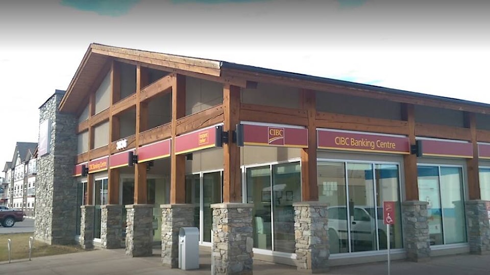
A downtown business will be getting some new signage after the town allowed for a few variances to the sign bylaw.
Smithers Council voted in favour to approve a development variance permit to vary the sign bylaw and allow CIBC on Fourth Avenue to increase the number of permanent signs permitted per business frontage from two to three and to increase the maximum size of fascia signs.
However, council denied a request to permit the use of white plastic or acrylic.
It all began in December 2021 when Priority Permits submitted a sign permit application for the local bank. The company wanted to replace the existing sign faces with new ones of similar size and material. However, their existing signs are non-conforming on several counts and town staff advised them the new signs must comply with the current sign bylaw requirements unless a Development Variance Permit was approved by Council.
Their current signage was approved in 2007 when the town had minimal restrictions pertaining to total number of signs permitted, sign materials, lettering, lighting, and area. The sign bylaw has been updated twice since the existing CIBC signs were installed. The current sign bylaw has significantly higher standards for sign design, especially for properties in the downtown core area.
In August 2022, according to town staff, the applicant resubmitted the sign details, with several improvements over the initial design. Recognizing that the revised sign proposal still does not comply with the Town’s sign standards in terms of sign area, the matter was brought to council.
Jordan Desrochers of Priority Permits, spoke on behalf of CIBC, to council at their regular meeting on Sept. 27.
“We’ve reduced the plastic faces to aluminum, so it’s almost more of an architectural feature now, instead of a bunch of single signs and changed the copy to aluminum letters, so there is no more vinyl. The design also uses gooseneck lighting, we’re no longer using illuminated sign cabinets so the light proliferation is minimized,” he explained.
“I just want to make sure everyone understands that we try to work through the process. We think we’ve come up with an option that still keeps with consistent branding with the other locations while also sticking with the town guidelines.”
Mayor Gladys Atrill was pleased to see the town and the bank come to a compromise.
“We’re more easily able to hold a local business to our standards, I realize we don’t hold them all. But there’s something odd that happens with the national branding,” she said. “I’ve been in other communities where national brands are completely subservient to community brands. Sometimes we feel so pressed by the national brands that we feel like we can’t ask them to do anything. So eventually people like to have signs on their buildings and they’ll fit in. So it’s just interesting, like it seems weightier somehow, when we’re trying to say no to a bigger company who actually has probably more ability to create all kinds of really cool stuff.”
All of council agreed with town staff that the official community plan recognizes business signage as an important component that determines the overall form and character of the development permit areas, most importantly in the downtown commercial area.
However, they considered the variances to be a good compromise between the bank’s need for national branding and the town’s guidelines.